As you can see… we have a new Clarity website. I really hope you like it! Here’s an explanation of the changes and a guide to the new site.
Why change the design?
Because the old one was old – some nine years old, in fact – which means it wasn’t at all adapted for browsing on smartphones/ tablets. (You may have found it disappeared from Google search results on your phone – that would be why.) So that had to change… and while I was working on that, I’ve also tried to make it look a bit less like 2007.
In the process I get to do something I always wanted: fill the site with images of the natural world, showing what Yi is and what it’s made of. When I started out, ‘site full of images’ meant ‘site no-one can actually load over their dial-up connection’ – but times have changed, and there’s no need for a site about the Yi to look like a site about a bank.
The new header image shows the sun emerging from behind clouds – which is (probably) what the Chinese character yi originally represented. Yi is change as in ‘a change in the weather’ and ‘the emergence of light’ – something I didn’t yet know in 2000 when I named the business ‘Clarity’.
‘Life can be translucent’, says the header. That’s my idea of what Yi does – it opens up ordinary life so meaning shines through.
What’s changed?
Content-wise…
Not a huge amount has changed. What I’ve done is to move things round and consolidate all the learning material in one place. So instead of a private free course for members and a bunch of public pages that sort-of more-or-less duplicate its material, there is a single free beginner’s course. You’ll find it (unsurprisingly) under ‘Learn’.
There are still bonuses for free members. The difference: you don’t have to seek out a separate download area to find them, you only need to be logged in when you look at the course pages. On the same page, people who haven’t joined (or aren’t logged in) will see messages saying ‘Sign up to get this download’, while as a member you’ll just see a link to download it.
If you’re on any page and not seeing what you think you should (eg if you’re a Change Circle member not seeing the full Foundations Course), click ‘log in’ at the top right.
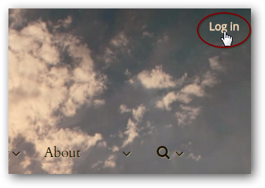
You’ll be redirected back to the same page afterwards, now displaying the right version for you.
Navigation-wise…
You no longer have to click over to ‘Learn’ to see what’s available there. Any main page is available from any other page – just mouseover/ tap on the main menu.
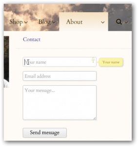
Site search is also available directly from the main menu, and so is a contact form under ‘About –
That’s on every page except the forum, where you’ll just see a link to the contact page. Please use one of these if/when you find bugs!
Finding forum things
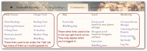
Mouseover/ tap on ‘Community’. Here you’ll find a complete list of forums and – once you’re logged in – the forum search options, notifications, private messages and links to profile and settings. On a computer, you mouseover and then click what you want; on mobile, you tap a submenu to open it and then a link to access it.
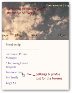
So everything that was under the ‘Talk’ tab is here, and so is most of what you used to access by clicking the ‘account’ link in the top right-hand corner. The exception to that: the log in form and the link to your main account page for Clarity as a whole (not just the forums) are still at the top right:
Go to the ‘Your Account’ link at the top right if you want to –
- see everything you’ve purchased
- change your password
- change your registered email address (for forum notifications and product orders)
- change your username (that’s for future posts – it won’t affect what’s displayed on your previous posts)
- delete your whole account at Clarity
Use the ‘Forum settings’ link under the ‘Community’ menu if you want to –
- tweak how you appear on the forum – profile picture, the avatar by your posts, etc
- change your forum signature
- change any of your forum preferences: skin, subscriptions, friends, private messaging etc
- access your bookmarks (CC members)
To access what you’ve purchased…
Log in, and then –
You can look under the relevant tab: access Reading Circle, WikiWing, Yi Academy etc via the ‘Community’ menu; access the Foundations Course via ‘Learn’ and the ‘Treasure Chest’ extra articles via Learn > More tools – or from the ‘Change Circle’ home page under ‘Community’.
You can also click ‘Your Account’ in the top-right hand corner of every page for… well… your account, which includes a list of direct links to ‘active resources’.
Using the forum on your phone/ tablet
I’ve had the menu adapted to be mobile-responsive in the forums too, so you may be quite happy using the forum just as it is. But if you’d prefer something simpler, there is a mobile skin you can choose as your default instead. To try it –
- At the bottom of the ‘Community’ menu, tap ‘Forum settings’
- In the left-hand menu under ‘My Account’ tap ‘General settings’
- In the very last section of this page, ‘Miscellaneous options’, you’ll find a dropdown menu for ‘forum skin’. Change that to ‘default mobile style’ and tap ‘save’ at the bottom of the page.
This gives you a rudimentary, very quick and simple version of the forum: no links to the rest of the site, no ‘post thanks’, no settings page or hexagram search. Its main menu is the blue square grid icon at the top right.
To change back, click ‘full site’ at the bottom of any forum page, and then make your way back to the settings page again to switch your default skin.




All things change. Our favorite book teaches us that. It looks very good. Before the tablet owners emoji you bronze pennies and electric flowers, let me acknowledge the close of a very warm, friendly online I Ching design that’s been a good friend to me for many years. I hope never to go through those changes again (& I’m planing on living twice as long as most modern cave people). Much love, wisdom, and frequency blessing to you, Hilary!
Thank you, John :). I’ll also admit to a bit of nostalgia as the old site disappeared – though not too much, as it was a nightmare to maintain. Hope you get used to the new version and find it equally friendly!
If it ain’t broke, why fix it?
I have experienced many in depth communications with I ching over the years on your site. I found it extremely facilitating whereby I did not need to throw coins or even type in question. I just asked a question and pressed “consult the I ching” that was it. Now it looks as though I get a line with each throw.
Sorry to lose the layout of the old free reading, primary and relating hexagrams side by side with oracle, image, sequence and lines. The overview it gave was genuinely useful and it will be missed.
Lawrence, if you’d tried to access the site on a mobile device (as most people do nowadays) you would probably have thought it broken and seriously overdue for fixing! But anyway, as regard the free reading in frames, see https://www.onlineclarity.co.uk/freeicr/indexF.html. 🙂