Here is a proposed new design for onlineClarity (blog and forum included).
*update!* Here is an alternative version of the design for comparison.
We’re still at the stage of deciding on the look and feel. Colours, layout, graphics, spacing… all that. (Working links and text will come later.) You’d be doing me a huge favour if you could take a look, follow the link to the forum thread I’ve started about this, and share your thoughts. Or if you’re not a forum member, by all means post here, or email me. Either way… what do you think?


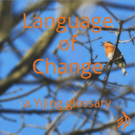
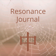

I like both, but prefer the new one I suppose? Well done regardless!
Hey there ~
Actually I like the shadowed header above better than your new designs. It seems to stand out from the page with great CLARITY! What software did you use to design it?
Thanks for your generous contributions to the tribe 🙂
Eric
As you will see my site I like it simple and your is simple as I like. I hate to wait for videos and other stuff until you can see something of interest.
Good luck with your new site
Regards
Erich
Thank you Pat, Eric and Erich. No – there will be no sitting staring at a ‘loading, please wait’ sign here 🙂 . Eric – that was just a couple of text effects in Ulead PhotoImpact. Very easy to apply.
Clarity, they both look good, but I think I have a shade more liking for the alternative one. Actually, I was thinking of something completely different, like a hexagram with bowling ball that flies down the middle and knocks out the tao symbol, and when it settles, there’s the page. I remember when I was looking at different Web Musos’ pages and one company said for the design with the front door that leads to a room with all the doors labelled, the musician and his life, with an appropriate story behind that door, another one with pictures of the musician in concert and finally one on the right with the discography of the musicians’ work behind that door. All looked great until they said that would cost a couple of hundred thousand dollars. Stick to the original, though I only like the alternative one a shade better.
All the best whichever way you go. Ask the I Ching what it thinks?
Nick from down under, at the start of a long cold winter.
Clarity,
My preference is the alternative design with the larger logo. I think the gradient at the top of the proposed design is too much — in the alternative design this banner is smaller and easier to look at. The larger logo adds punch. It is YOUR site, and I don’t think there is anything wrong with displaying an indication that it is indeed the site we are looking for when we come here. The logo in the proposed design gets lost and it’s hard to tell what it is.
I’ve been an artist and designer for 25+ years (or maybe it’s +++ years…), designing books, websites, software interfaces, etc., as well as teaching design, and one thing I always try to establish is a rhythm. You’d think rhythm would only relate to music, but it’s a way, in whatever medium your using, to give your viewer (or listener) a way to easily assimilate the information you are providing. This is done with proportions (loud sounds, soft sounds), spaces between elements (rests), pacing (beat), and other elements. By doing this, the brain is able to retain information and make the choice between placing information into long- or short-term memory, depending on need.
I, for one, prefer simplicity, rather than bells and whistles. I think in terms of, perhaps Japanese inspired design, which means getting to the essence and allowing the viewer to fill in the details visually. When someone sees a sumi brush painting of a single stalk of bamboo bending into the wind, it’s pretty obvious that the artist doesn’t need to show the wind (even if this were possible), because we are able to complete that gestalt ourselves. You essentially invite the viewer into the picture by doing this.
So, my advice would be to keep it simple, and provide good proportions as you have done in the alternative design, and keep up the excellent content you have been providing us.
Thank you 🙂
The second design is definitely better. has more clarity ! 🙂